
Why Online Shoppers Abandon Carts—and How to Reduce Checkout Friction.
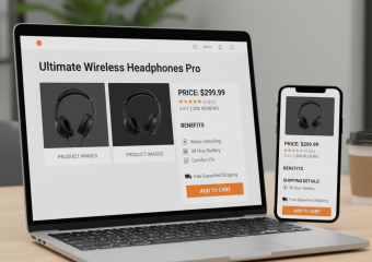
Why do interested customers place products in their carts, begin the buying process, and then leave without completing their orders? Cart abandonment is rarely caused by a single issue. More often, shoppers encounter unexpected costs, confusing forms, limited payment options, or other obstacles that make checkout feel harder than it should. For small business owners, understanding these concerns is the first step toward creating a smoother experience that helps more customers complete their purchases.
Why Online Shoppers Abandon Their Carts
Not every abandoned cart signals a problem. Some people use carts to save products, compare prices, or estimate an order total. Others may simply become distracted. However, preventable checkout friction can drive away shoppers who were otherwise ready to buy.
Unexpected Costs Appear at Checkout
Surprise shipping fees, taxes, handling charges, and other added costs can change how customers feel about an order. A product may appear affordable on its page, but the final total can exceed the shopper’s budget once additional expenses appear.

Businesses can reduce this frustration by communicating costs early. Display shipping policies clearly, offer an estimate before checkout when possible, and explain the requirements for free shipping. Customers are more comfortable moving forward when they understand what they will pay.

The Checkout Process Is Too Complicated
Long forms and unnecessary steps can turn a simple transaction into a chore. Asking customers to provide information that is not essential to payment or delivery increases the time and effort required to order.
Review every field in the checkout process and ask whether it is truly necessary. Remove optional questions, use address suggestions when appropriate, and allow billing information to match the shipping address with one click. A progress indicator can also help customers understand how many steps remain.
Customers Are Required to Create an Account
Account creation can benefit returning customers, but forcing it before purchase may discourage first-time shoppers. Some buyers do not want to choose a password, confirm an email address, or sign up for an ongoing relationship just to place one order.
Offering guest checkout removes this barrier. After the sale, businesses can invite customers to create an account using the information they already entered. This keeps the initial purchase simple while still presenting the benefits of registration.
Payment Options Are Limited
Customers have different preferences for paying online. If a store does not accept a familiar or convenient method, a shopper may hesitate or leave. This is especially relevant on mobile devices, where entering card details can be inconvenient.
Small businesses should support payment methods that fit their audience and market. Common credit and debit cards are essential for many stores, while digital wallets, accelerated checkout tools, or installment options may also be useful. The goal is not to offer every method available, but to provide a practical selection without cluttering the page.
The Store Does Not Feel Trustworthy
Customers need confidence before sharing payment and personal information. An outdated design, unclear return policy, broken page, or lack of contact details can create doubt. Errors during checkout are especially damaging because shoppers may worry that their payment will be charged incorrectly.
A professional design, accurate product information, accessible policies, secure checkout, and visible customer support details can strengthen trust. Reviews and testimonials may also help when they are genuine, relevant, and presented without exaggeration.
The Mobile Experience Is Frustrating
A checkout page that works well on a desktop computer may still be difficult to use on a phone. Tiny buttons, crowded fields, slow pages, and menus that cover the screen can make customers abandon an order.
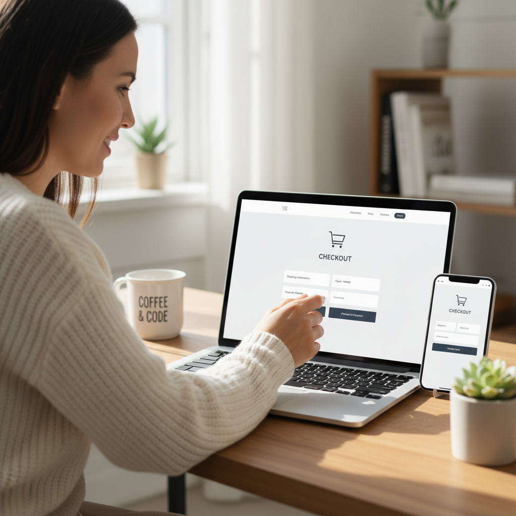
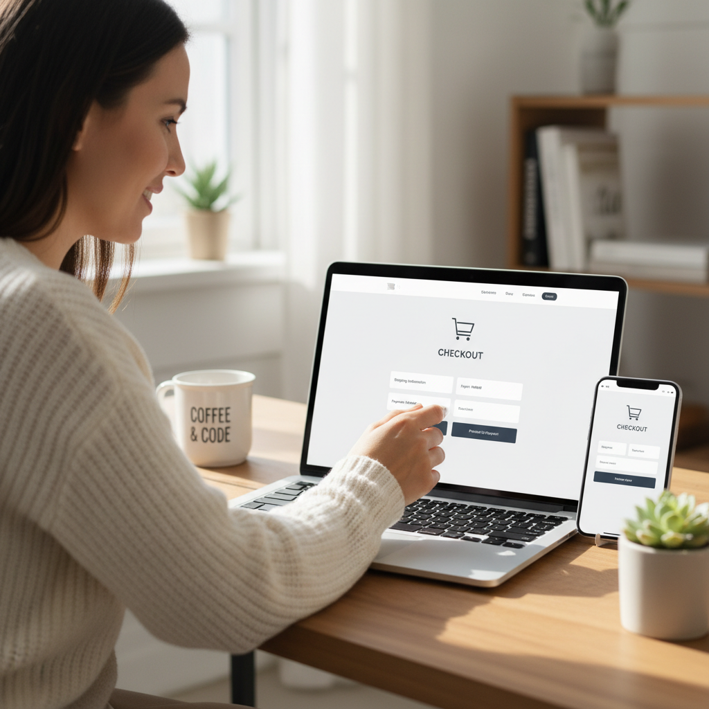
Test the complete purchase journey on different mobile devices. Pay attention to text size, button spacing, form behavior, page speed, and error messages. Customers should be able to review their carts, enter information, and submit payment without zooming or repeatedly correcting fields.
How to Reduce Checkout Friction
Reducing friction does not require removing every feature from checkout. It means eliminating avoidable obstacles while giving customers the information and reassurance they need.
Make the Next Step Obvious
Use clear button labels such as “Continue to Payment” or “Place Order.” Keep the primary action visually distinct and avoid surrounding it with competing links or promotional messages. Customers should always know what will happen when they click.
Provide Helpful Error Messages
When a form contains an error, explain the problem near the relevant field. A general message such as “Something went wrong” forces customers to search for the issue. Specific guidance helps them correct mistakes quickly without losing previously entered information.
Keep the Cart Easy to Edit
Shoppers should be able to change quantities, remove items, review product details, and see updated totals without restarting checkout. Avoid unexpected cart changes, and clearly explain inventory limits or discount requirements.
Measure the Checkout Experience
Business owners should regularly complete test orders themselves. Analytics can show where customers leave, while support questions and customer feedback can reveal confusing details that numbers alone may not explain. Make one meaningful improvement at a time, then monitor whether it helps.
A Better Checkout Builds Customer Confidence
Cart abandonment cannot be eliminated entirely, but unnecessary checkout friction can be reduced. Transparent costs, guest checkout, concise forms, reliable mobile performance, suitable payment methods, and clear policies all make purchasing easier. For small businesses, the most effective checkout is not necessarily the most elaborate one. It is the one that feels simple, predictable, secure, and respectful of the customer’s time.